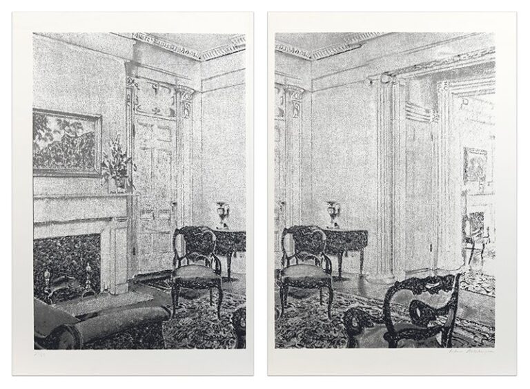
Edition 27 of 83, this being a unique variant, altered by the artist
Overall size approximately: 32 3/4 x 44 3/8 inches (83.2 x 112.7 cm)
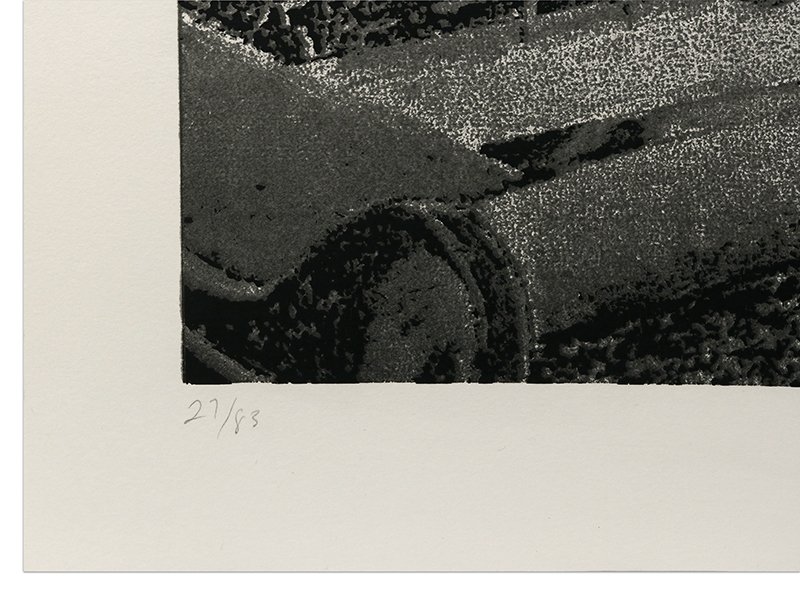
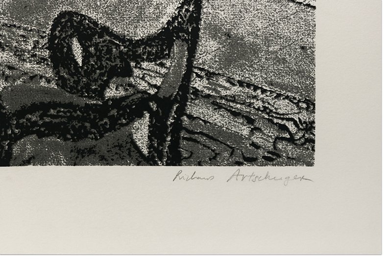
Signed lower right and numbered lower left in graphite
(Inventory #30890)
Edition 27 of 83, this being a unique variant, altered by the artist
Overall size approximately: 32 3/4 x 44 3/8 inches (83.2 x 112.7 cm)
Signed lower right and numbered lower left in graphite
(Inventory #30890)
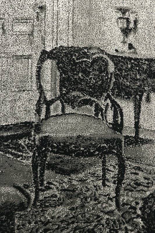
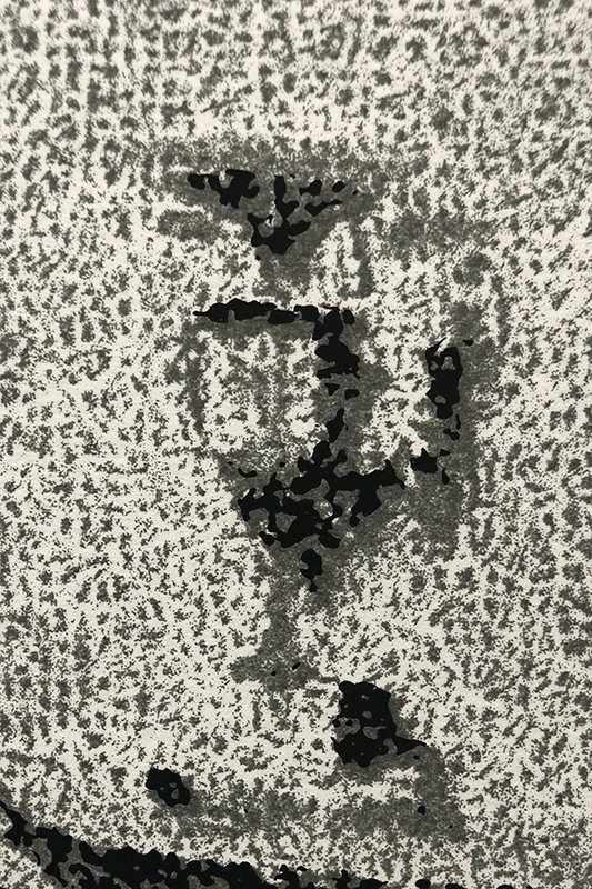
Richard Artschwager’s work explores perception and recognition through abstracting, altering and repeating elements. In “Interior,” a single interior is viewed through two juxtaposed images. A viewer’s natural assumption would be that the two images combine to create one scene, either through two different perspectives of the same space (perhaps even stereoscopic) or one image cut into two sections. However, Artschwager has done neither. Each section is part of a single larger image, but each section includes part of the other section, thus repeating certain elements (side table, corner of the room, etc.). The visual texture that Artschwager uses (and for which he is known) provides a sense of nostalgia (like a grainy black and white film). The scenario depicted furthers this sense of nostalgia by being a Victorian-era room. However, by creating the work as a three-color silkscreen, the artist keeps the viewer aware that the piece was not made in that Victorian era. Artschwager’s artistic gestures, often considered enigmatic, provide a viewer with the opportunity the calm pleasure of the familiar, the simple awareness of surface as image, and the dynamic reality of life requiring dynamic and open-ended appreciation.
Richard Artschwager (1923-2013) was an American sculptor and painter. During the 1950s he designed and made furniture in New York, but after a fire that destroyed most of the contents of his shop in 1958 he turned again to art, initially painting abstract pictures derived from memories of the New Mexican landscape.
Artschwager had the idea of producing sculptures that mimicked actual objects while simultaneously betraying their identity as artistic illusions. At first these included object trouvés made of wood, overpainted with acrylic in an exaggerated wood-grain pattern, but he soon developed more abstract or geometrical versions of such objects formed from a veneer of formica on wood. His preference for synthetic materials considered to be in debased taste together with his references to everyday objects were central to his response to Pop art. Similarly his blocklike sculptures had much in common formally with Minimalism.
From 1962, Artschwager also painted grey acrylic monochrome pictures, basing his images on black-and-white photographs, characteristically of modern buildings as shown in property advertisements, as in Apartment House (1964; Cologne, Mus. Ludwig). Gradually his paintings became more complex and mysterious, the surface subsumed in a pattern of flickering light, for example in “The Bush” (1.22 x 1.79 m, 1971; New York, Whitney). His emphasis, however, remained on ambiguities of perception-on the interaction of observation and illusion-especially in sculptures conceived as hybrids of recognizable objects, such as Book III (Laokoon; formica on wood with metal handles and vinyl cushion, 1981; Paris, Pompidou), part lectern and part pew.
—
E.C. Baker: ‘Artschwager’s Mental Furniture’, A. News, 66 (1968), pp. 48-9, 58-61.
Richard Artschwager’s Theme(s) (exh. cat., essays R. Armstrong, L.C. Cathcart and S. Delehanty; Buffalo, Albright-Knox A.G.; Philadelphia, U. PA, Inst. Contemp. A.; La Jolla, CA, Mus. Contemp. A.; Houston, TX, Contemp. A. Mus.; 1979)
Artschwager, Richard (exh. cat. by R. Armstrong, New York, Whitney; San Francisco, CA, MOMA; Los Angeles, CA, Mus. Contemp. A.; 1988-9)
Marco Livingstone; Copyright material reproduced courtesy of Oxford University Press, New York
10 Newbury Street, Boston, Massachusetts 02116
617-262-4490 | info@krakowwitkingallery.com
The gallery is free and open to the public Tuesday – Saturday, 10am – 5:30pm