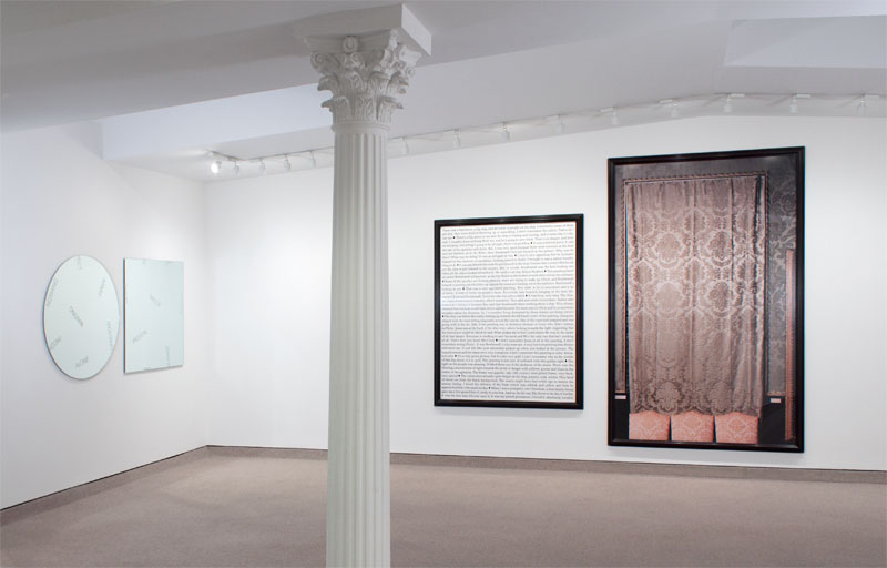
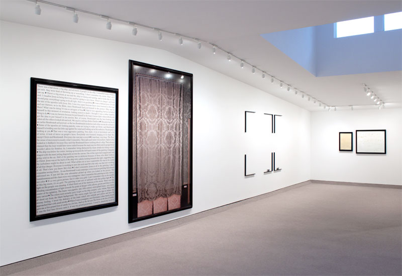
In 1947, Mark Rothko wrote that “the familiar identity of things has to be pulverized in order to destroy the finite associations with which our society increasingly enshrouds every aspect of our environment.” Each of the works in this exhibition successfully overcomes the limitations that come from the ‘finite associations’ with which popular society operates most easily by balancing hidden, overt and subtle information, thus providing open-ended opportunities for exploration.
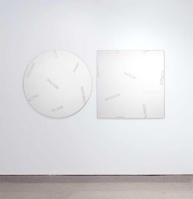
Robert Barry’s mirror-piece consists of two mirrored glass panels. The diameter of the circular element is equal to the length of the side of the square element (40 inches / 100 cm). Both panels are inscribed with various same sized block-letter words. Barry evenly dispersed these words across the surfaces of the panels in different orientations and states of completeness (some extend off the edge, some begin off the edge and others are fully present). Barry”s choices of layout, arrangement and juxtaposition do not point to a specific narrative, description or relationship. However, when looking at the physical objects of the mirrors and thinking about the consistency of choices, one recognizes the particulars of the setting, as the work is mirror. The words and shapes combine the traditional form of art (perhaps a window into another world) with mirror (reflection of the world within which the object exists). The meaning of the work depends on the viewer”s presence and is a combination of the physical objects, the words as graphic representations, the reflections of the surrounding environment and the viewer’s interpretations and associations among these elements. The piece explores the interaction of meaning and context all the while blurring the boundaries between art, object and situation, as well as writer, artist and viewer.
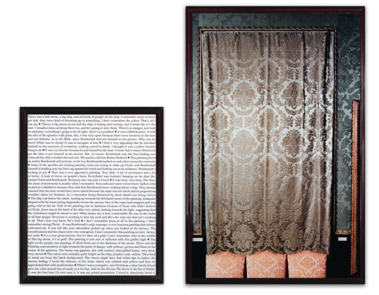
In Sophie Calle’s work, Last Seen (Rembrandt, The Storm in the Sea of Galilée), she created a poetic remembrance of the theft of thirteen works in 1990 from the Isabella Stewart Gardner Museum in Boston. The repercussion of Gardner’s stipulation in her will that the arrangement of the galleries remain fixed is that a sense of loss remains a permanent fixture of the museum. Calle recognized this and shortly after the crime interviewed curators, guards, and other staff members, asking them to describe what they remember of each of the absent works. The responses vary dramatically and thus show the variations in memory, awareness, perception and involvement different people have with any given work. The physical manifestation of Calle’s work is a framed, life-size photograph of the ’empty’ space and a framed text consisting of the various responses. Conversation and memory, which are most often ephemeral, become concrete and where a painting once was is now just a memory.
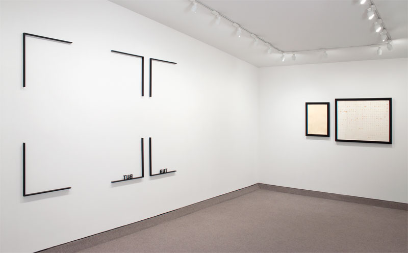
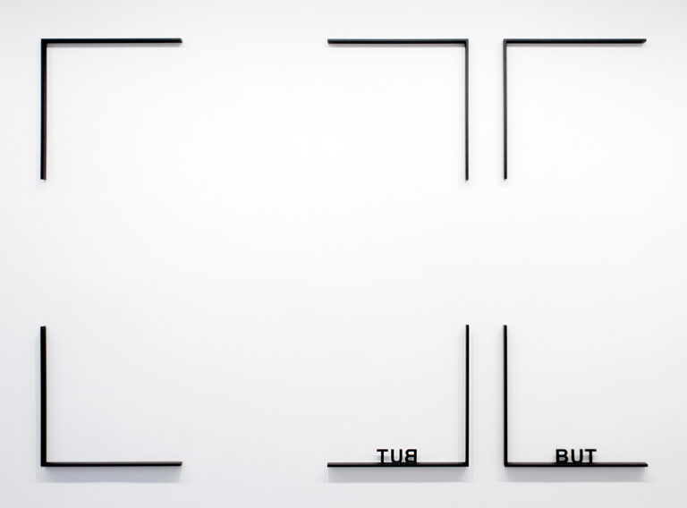
Peter Downsbrough’s work BUT, BUT consist of six metal elements that are to be installed within a fixed arrangement, yet the size of the overall installation may vary. Most easily legible within the work is the word “BUT”. To its left is the same word but a mirror image thereof. Each one of these words is laser cut from metal and hovers 1/2″ away from the wall, as each letter is attached to the 1″ deep piece of metal that forms a right angle. All six elements contain form angles, four of which combine to create the corners of a square. The two other elements reference the corners of, what one could imagine is, a second square that is missing its right corners. The “reflection” of “BUT” is within a square, yet the actual “BUT” is left unconfined, open-ended and left to be a conjunction on the wall with whatever comes after it. With all of this reading, it is hard not see the reflection of the “BUT” as a contained object. While it can be contained in a bigger or smaller square (size variable installation), it cannot lead to anything else – it is merely a contained (read: fully understood) reflection. However, the actual “BUT” is open-ended, a reminder of the relationship between the “real” and the “reflected”.
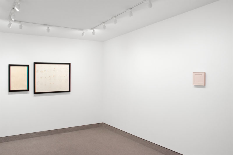
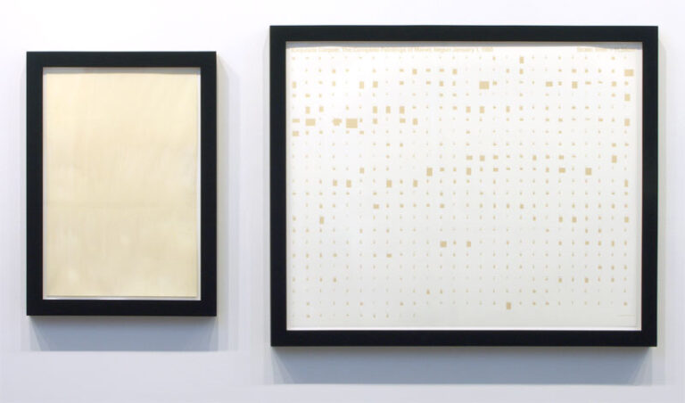
Two framed pieces of paper comprise a diptych by Stephen Prina that is included in this exhibition. While not readily apparent, this diptych is from an ongoing series. The right piece of paper graphically lays out the relative size and shape of each of the 556 paintings that Edouard Manet painted over the course of his life. The small monochrome shapes are proportional to the sizes of Manet’s actual paintings. The piece of paper on the left is a gestural ink wash on paper that is the exact size of one of the 556 paintings Manet painted. The references within the piece also include the accurate title of the related painting (in this case it is the 218th – Masked Ball at the Opera with Punchinello) and that the order in which the paintings have been created are the same for Prina’s as it was for Manet’s. When looking directly as the piece in this exhibition, a somewhat mysterious system seems apparent, whether because of the chart-like piece on the right, or the pairing via identical frames of the companion pieces of paper. In addition, the title, “Exquisite Corpse: The Complete Paintings of Manet, begun January 1, 1988”, the “Scale: 1mm=11.39cm” and then the ownership of the image: “© Copyright 1988 Stephen Prina” are all presented as facts. On the reception counter is the checklist referencing each piece in the exhibition, which in this piece’s situation, includes the titles of the actual Manet painting being referenced (more facts, but fully invisible if just looking at what’s on the wall). With all of this information, one can accept the reality of the project or extend beyond and imagine the Manet painting and the entire body of Manet’s work. One can also question the validity of the information – which because of Prina’s 1960’s Manet catalogue raisonné, is in fact, outdated and no longer fully accurate.
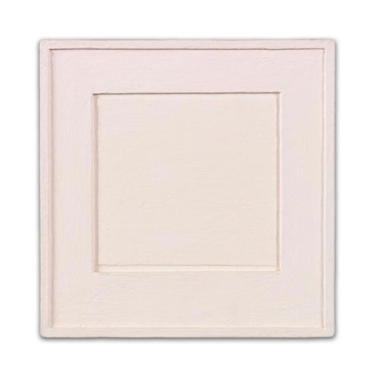
Allan McCollum’s Surrogate Painting is one of the earliest examples of McCollum’s surrogates. It was made from wood and museum board, glued and pressed together, and painted all over with numerous coats of paint. In 1979, Tiffany Bell reviewed McCollum’s exhibition of the Surrogate Paintings and stated the following: “Allan McCollum’s recent paintings could easily fit into context with the work Joseph Masheck has described as “Pictures of Art” in his essay of that title (Artforum, May, 1979): each one has the appearance of being a painted-over painting. The objects are small, literally shaped in relief like framed and matted painting, drawing, prints or photographs, and each, entirely including the sides, painted in a single, flat color. The idea seems to have been to reduce the paintings to their most common and recognizable elements in terms of their perception as framed objects on the wall. The result, paradoxically perhaps, is that one’s attention is thrust out from the interior space of the object to that which surrounds it.” Thirty-three years later, the Surrogate Painting, now no longer just a single austere surrogate for a framed work hung on a wall but, now the generic-ness of the work has become specifically recognizable by many as a Surrogate by Allan McCollum. The issue of specificity has been complicated by time in a way that provides an even greater conversation than before.
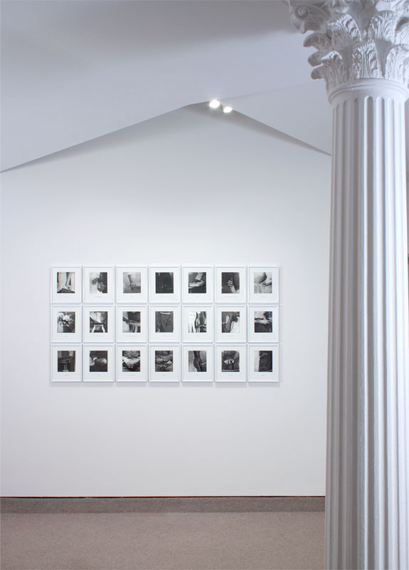
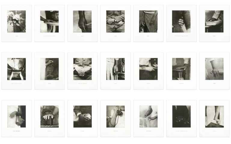
Lorna Simpson’s Details consists of 21 photogravures with juxtaposed silkscreened texts. The imagery of the photogravures was taken from the artist’s collection of family photos that she then edited and cropped. The accompanying texts, also cropped and edited, are descriptions of the artist’s family members. The gravure process gives a specific feel of age to the images, unifying them in one period and yet the texts are silkscreened and thus have a much more contemporary feel, leading one to not only explore and question the information within any of the images and texts, but also the relationship between the text and image. Unified on the same piece of paper, yet printed using different techniques, one seemingly much older than the other, makes one see the texts as coming after the images, in effect making them labels – things placed on other things to try to locate/describe them. Seeing as labels are rarely fully accurate and most often not useful in deeper understandings, it is interesting to note that the artist specifically jumbled the descriptions to no longer be ‘attached’ to the corresponding images, which further clarifies the experience of understanding the limitations of labels.
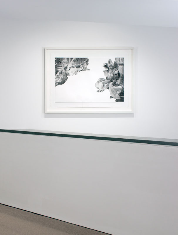
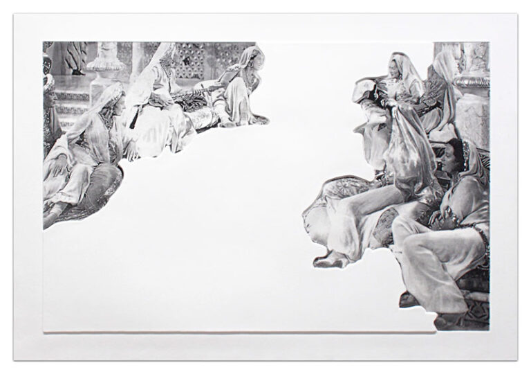
John Baldessari’s Crowds with Shape of Reason Missing is, in one sense, the most straightforward work in the exhibition. Baldessari has taken a film still and removed the central focus of the scene, thus, as the title of the work suggests, the shape, of what or whom-ever everyone is looking at, is missing and the viewer is left to wonder what is actually occurring in the scene. However, Baldessari adds to the gesture by actually creating a sculptural relief in cast paper to be situated in this void. What initially looks like a removal and loss has been transformed into an addition. This can be said, too, of the work as a whole. What was once a B-movie set with a supposedly simple plot line has been turned into a scenario where the supporting cast is the immediate focus with all its subtle relations and the formerly central focus is now a mysterious form that provides the opportunity for dynamic and semi-surrealistic mysteries.
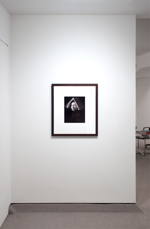
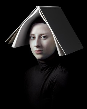
Since 1995, Dutch photographer Hendrik Kerstens has been photographing his daughter, Paula. He uses his daughter as his model, immortalizing her, picturing her in relation to events in her own life as well as projecting onto her his fascination with the Dutch Master painters of the seventeenth century. Conceptually, Kerstens’ photographs play with the dialog between the mediums of painting and photography, all with a nod to the subjects of time and humor. On a more emotional level, they address everyday reality while expressing his love for his child, and the knowledge and development of his craft. His ‘Paula Pictures’, are reminiscent of Vermeer’s painting. The austerity and clarity of the photographs, coupled with the serenity of the subject and the characteristic ‘Dutch’ light all combine to create striking, beautiful and haunting works of art. However, Kerstens does not just imitate painting. As the series progressed, he became increasingly interested in the game of creating a conceptual and humorous dialog between past and present. Napkin looks like a maid’s bonnet. In Bag, a plastic grocery bag is shaped to look like a lace hood and in this piece, Book, the book serves as a nun’s wimple.
With all these explanations and clues into the backstories, meanings and processes of the works, what holds them together as an exhibition is their formal properties. Variations on similar structures provide opportunities for comparisons and conversations between the works.
