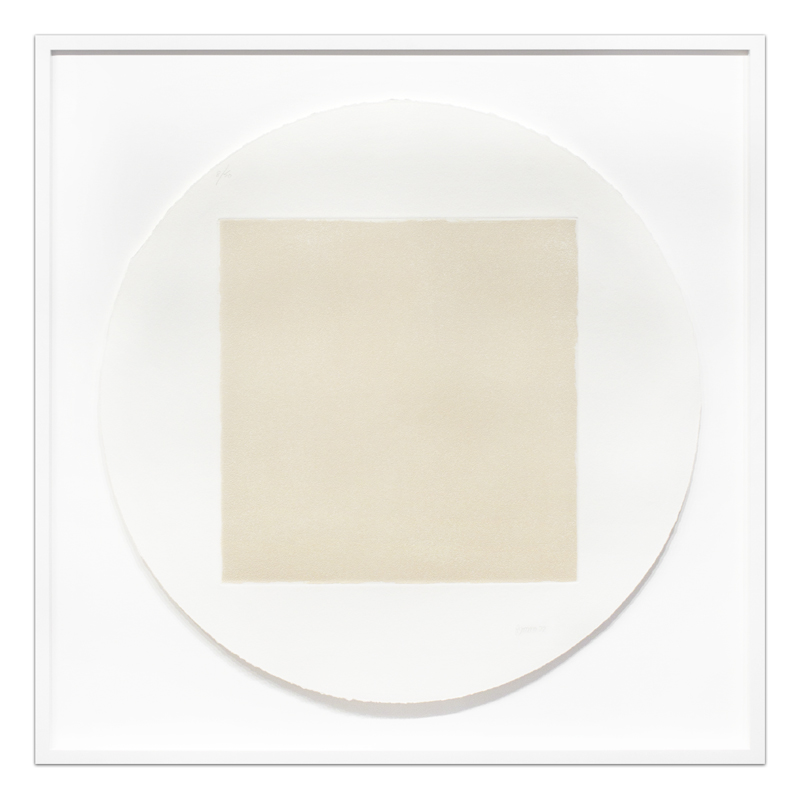
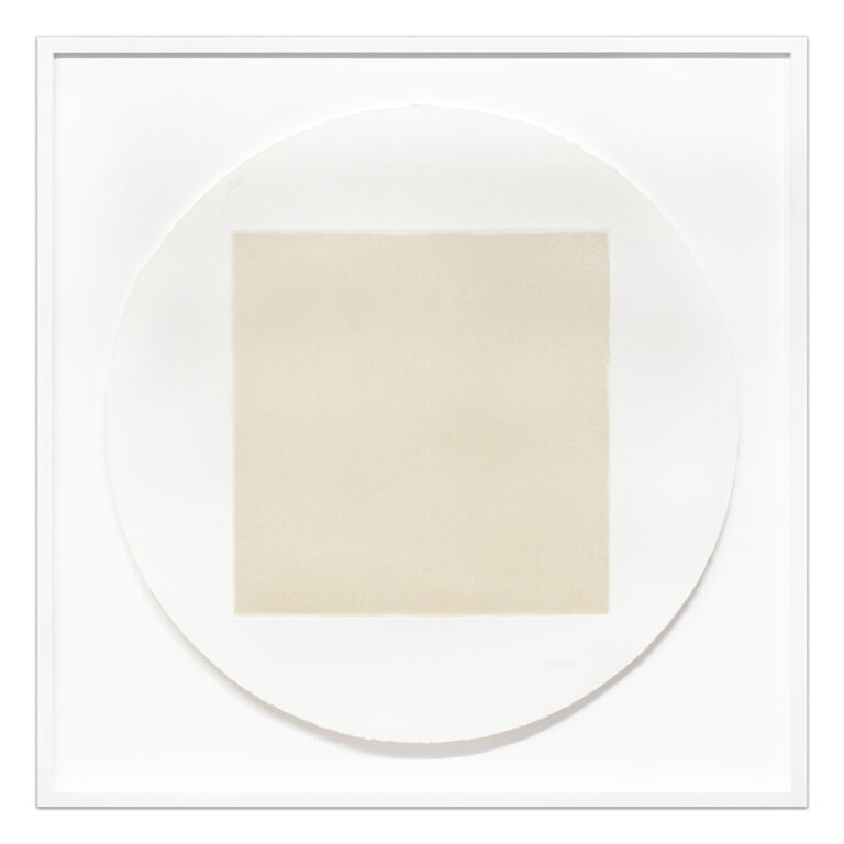
Robert Ryman, Untitled [5] (from Seven Aquatints), 1972
The works in “Cornering the Round” use geometry, repetition and reductive palettes, causing close observation and careful consideration of both the inherent properties within the works and their philosophical implications.
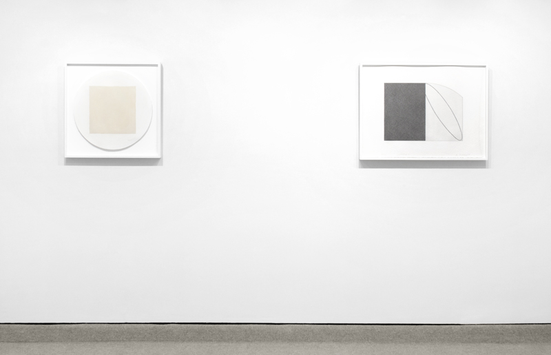
In Robert Ryman’s untitled aquatint from 1973, the seemingly cold blank square form is subjected to specific decisions to present a more dynamic visual experience. While the straight edges of the copper plate used in the etching leaves a rigid square indentation in the paper, the irregular edges of the inking and aquatinting on the plate leave subtle but consistently ragged edges of the actual image printed. The image is made from White Lead ink that varies greatly from the white of the paper. In addition, unlike a vast majority of art on paper, Ryman has hand-torn the paper to form a circle and like the image of the square, the edges are irregular and thus the contrasts are heightened between the round and the straight, direct (ripping) and indirect (printing) processes and the different whites, all causing an incredibly attentive eye to ask questions of ‘why’ and ‘how’ of every possible decision.
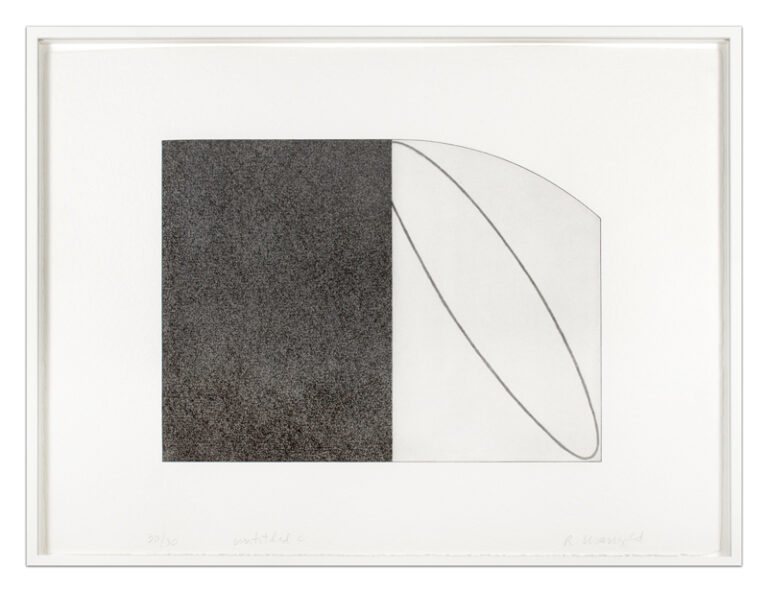
Robert Mangold’s “Untitled (C)” from 1995 also uses contrasts in form and tone, but instead of using the paper as part of the form, he creates a printed image on the paper so as to give boundaries to the investigation. The left half of the image is, on first glance, a monochromatic dark grey, but upon closer inspection, one notices that there are two layers of tone – an even medium grey and then a darker and irregularly grey. The mottling is seemingly in conjunction with the thick texture of the paper. On the top, bottom and left sides of this rectangle of two greys is a thin darker line that demarcates the printing plate’s edge. The outline is the same size and shape as the indentation of the plate used in the printing, yet it is actually a specifically etched line, as one can see in the minute striations that make up the line. This outline also continues around the right side (thus conjoining the two sides). The outline, on the right side, highlights the curved form of the plate in the upper right corner, which is both echoed and contrasted by the diagonal ellipse printed in the middle of the section. In addition, the line that makes the oval is an entirely different type of mark; instead of striations, it is made up of long soft gestures. Furthermore, the subtleties in the juxtapositions of tones of grey, geometry and texture are commingled by the recognition that the diagonal ellipse isn’t actually complete and that it is the viewer that must decide whether the hard edges of the left mean that the ellipse is incomplete or that the soft edges of the right are simply camouflaged behind the darkness of the rectilinear.
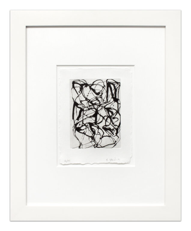
This sort of aesthetic and philosophical ‘battle’ is not unrelated to the inspiration of Brice Marden’s work. After a trip to Suzhou, China, Brice Marden became interested in the verses of the 8th century Chinese poet Han Shan (translates as “Cold Mountain” / for whom he named a series of works). Unable to read Chinese characters, Marden used the calligraphic structure of Han Shan’s poems as starting points for organizing his own graphic marks. In “Han Shan Exit”, an etching with aquatint from 1992, Marden builds up a web of lines that build an overall form yet never take away from the rhythm of the gestures, all within a simply toned and debossed rectangle.
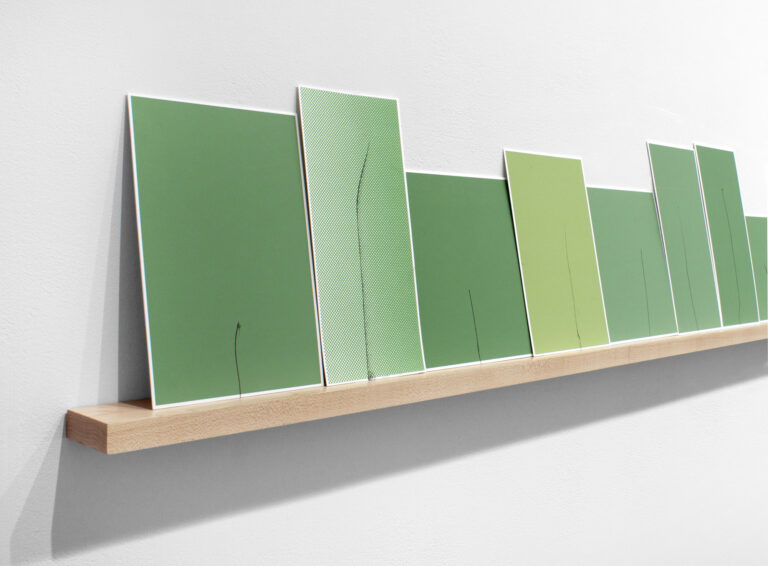
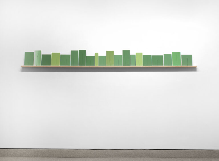
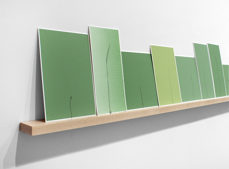
Kate Shepherd’s 2000-2014 installation work, “Challenging the Notion: Hawthorne, Poe, Melville (Green Grasses)” serves as the focal point and perhaps conclusion for the show, as the work looks at the idea of “group” identity. Consisting of 20 irregular lines on 20 unique green monochromatic silkscreens, each element is unique and individual, yet only together do they make the literal inference to grass. Referencing 19th century American writers, the work speaks to how America has been torn between “We the People” and the power (and only agency) of the individual, all while balancing the strong, straight rectangles with the soft strength of the wobbly lines.
