Archi-props
Exhibition View
Ed Ruscha
Archi-props
Exhibition View
Featuring works by
John Baldessari, Sylvia Plimack Mangold, Stephen Prina, Ed Ruscha, Fred Sandback, Kiki Smith, and Shellburne Thurber
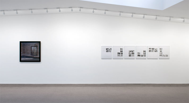
SPACE, featuring works by John Baldessari, Sylvia Plimack Mangold, Stephen Prina, Ed Ruscha, Fred Sandback, Kiki Smith, and Shellburne Thurber, sets out to engage the relationship between formalism, architecture and psychology. Visually, the guiding connections are a muted palette, a focus on the off-kilter and the significance of the unknown, unsaid or otherwise psychologically engaged.
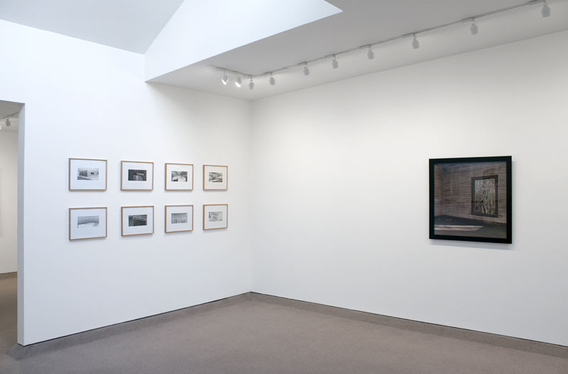
Ed Ruscha’s suite, “Archi-Props” consists of eight examples of industrial architectural buildings. Seemingly interchangeable except for their signage, the buildings both refute their specificity and yet cause a viewer to look for the slight variations from building to building, creating a subtle, balanced portrayal of the issues of individuality in an industrialized society.
Shellburne Thurber’s “Abandoned Mill House: Brown room with window view of the outside” pictures time, both natural and human-altered in a dynamic and challenging way. The interior of the building (the title explains that it’s a mill house) is worn and seemingly no longer in use (the paint is worn, leaves and debris are on the floor and no panes of glass protect the inside from the elements). The exterior appears to be late fall – the leaves have mostly fallen, the trees are bare and yet there are bits of vibrant color interspersed with the brown/grey of the forest. Both inside and outside are in decline, and yet we know that nature is cyclical and the leaves will return. Will the same happen for the man-made structure? Perhaps the bright illumination flooding in from outside is the poetic answer or nature reclaiming the space?
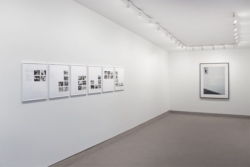
John Baldessari’s “Six Rooms” consists of six sheets of paper with a different arrangement of small found images on each sheet. In the artist’s own words, “My mind is a camera and thoughts are like furniture.” “Six Rooms” consists of arrangements of images with associated texts. Baldessari explains that the texts are “various qualities that make up the image of an artist today: Six roomfuls of unarranged furniture.” With this understood, the arrangements are not only psychological but spacial and associative.
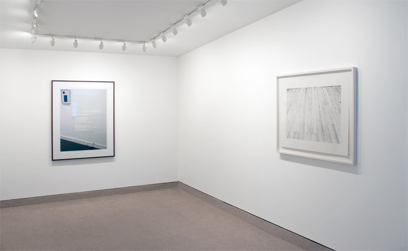
On the wall adjacent to Baldessari’s work is Stephen Prina’s “THE WAY HE ALWAYS WANTED IT V (Kunsthalle Baden-Baden, 2008)”, a framed photograph serving as a poster announcing the times and locations of the screenings of Prina’s film “The Way He Always Wanted It II”. The poster, itself, has no image directly coming from the film, but ‘beneath’ the text is a photograph from the Staatliche Kunsthalle in Baden-Baden showcasing a wall with a small Kazemir Malevich painting hanging towards the upper left of the picture plane and in the bottom right of the picture plane is what looks like a paint or ink stain. It is the remnants of the creation of a work in situ for Prina’s show that preceded the show with Malevich. The panel upon which the paint was sprayed is gone, but the remnants remain (the curator has actually declared that she never wants that spot cleaned!). Meanwhile, the text on the photo/poster are for events that have long transpired. The photo, itself, shows remnants of having been stapled (in his 2009 solo exhibition at Barbara Krakow Gallery) but is now framed with an island mat so as to accentuate and highlight the physicality of this piece of paper. What do all these facts with intertwined meanings and overt information, along with opaque, transparent and subtle references actually say? One can feel on the outside and not understand, or one can look and see an incomplete amount of information – some factual, some outdated, some mere clues, some presented outright, some through remnants and some obfuscated. Much like daily life, one asks many questions: How to make sense without all the information? How to feel comfortable being on the outside? When is one actually on the outside? Is the feeling of being included/excluded more an internal feeling or is it caused by outside forces? If a work can be enjoyed visually, does there need to be full understanding? Does there need to be meaning? What is meaning? This issue of inclusion/exclusion is perhaps key to understanding Prina’s work.
Sylvia Plimack Mangold, in the 1970’s, was focused on perception through the use of ‘vehicles’ such as floors and mirrors, rulers and tape. Plimack Mangold’s “Floor II” from 1974, depicts a wood floor in raking perspective. Towards the bottom of the paper, the lines that Plimack Mangold drew, to create a sense of wood grain, are thicker and more easily observable as drawn lines. As the space “recedes into the image”, the drawn lines become finer and less identifiable as illustrative. Plimack Mangold has balanced between the basic requirements for perspectival rendering of space with the opportunity to appreciate the illustrative lines that go from surface marks on a page to detailed descriptors of floorboards. In doing so, not only is Plimack Mangold focusing one’s attention on how one focuses attention, but she engages the issues of the methodical (strict perspective), balanced with the aesthetics of the casual (seemingly clumsy marks).
Fred Sandback’s untitled drawing from 1990, like other works in the show, balances between a potential, identifiable scenario and a purely artistic exploration. Consisting of graphite lines defining the wall of an interior space (which happens to be a Parisian domestic residence that Sandback made a work for in 1983) and pastel overlays, the drawing is both a proposal for a sculptural installation and a drawing that could not exist in three dimensions. The pastel rectangles overlap, almost like a Venn diagram. The left, darker, rectangle is much longer, while the right, lighter, rectangle is slightly taller (it extends above and below the darker one). As a two dimensional image, one can see the area of overlapping color and appreciate it abstractly as a formal relationship. Furthermore, one could see the two rectangles as being poetic representations of Sandback’s iconic yarn sculptures, these being floor-to-ceiling rectangles. However, the sculptures were always “empty” with only the edges of the “imaginary planes” being defined by the yarn. In the drawing, the entire “planes” have been filled in with fairly monochromic colors. So, as opposed to the yarn defining transparent planes (as is most often read into the artist’s work), in this drawing he posits an expanse of color/tone that shades one’s ability to see “through” the work and perhaps causes a bolder announcement of its presence. What works one way in three dimensions, sometimes calls for an alternate approach in two dimensions. Sandback takes this notion and explores it to an elegant, powerful and open-ended result.
Kiki Smith’s “Under the Weather” takes this notion of engaging two and three dimensions within the space space even further. Her digital collage consists of imagery taken from photographs of a “private performance” she documented, along with photographs of a small scale sculpture in the form of an interior that uses drawing on the surface of the sculpture to further define some of the space’s features. Smith uses light, dramatically, in both the photos of the sculpture and of the private performance as a way to present both scenarios as equally “real”. While the scale is radically different in each, Smith presents multiple moments and multiple perspectives for each and so, while the mystery is slightly unsettling, there is a strong sense that all is the same in the end, whether it is real, fabricated, known or unknown.
As one can see, the amount of information given by an artist, whether visually and/or textually, plays a strong roll in one’s understanding of “imagery”. For these artists, the information given is intertwined with the imagery used, all with a strong desire to engage issues of control, history, space and time.
Exhibition View
Exhibition View
Image size: 4 3/4 x 5 1/2 inches each (12.1 x 14 cm each)
Paper size: 11 1/4 x 15 1/8 inches each (28.6 x 38.4 cm each)
Frame size: 12 1/2 x 16 1/4 inches each (31.8 x 41.3 cm each)
Edition of 20
Signed and dated lower right, numbered lower left in graphite on each sheet
(Inventory #28290)
Image size: 4 3/4 x 5 1/2 inches each (12.1 x 14 cm each)
Paper size: 11 1/4 x 15 1/8 inches each (28.6 x 38.4 cm each)
Frame size: 12 1/2 x 16 1/4 inches each (31.8 x 41.3 cm each)
Edition of 20
Signed and dated lower right, numbered lower left in graphite on each sheet
(Inventory #28290)
Edition of 8
Signed on label on reverse
Image size: 30 x 30 inches (76.2 x 76.2 cm)
(Inventory #25263)
Edition of 8
Signed on label on reverse
Image size: 30 x 30 inches (76.2 x 76.2 cm)
(Inventory #25263)

Exhibition View
Exhibition View
Edition of 150
21 x 17 1/4 inches each (53.3 x 43.8 cm each)
(Inventory #23270)
Available only as a set
Edition of 150
21 x 17 1/4 inches each (53.3 x 43.8 cm each)
(Inventory #23270)
Available only as a set
Exhibition View
Exhibition View
Edition 2/12
Signed and dated bottom right verso, numbered bottom center verso
40 1/2 x 30 3/4 inches (102.9 x 78.1 cm)
(Inventory #20802)
Edition 2/12
Signed and dated bottom right verso, numbered bottom center verso
40 1/2 x 30 3/4 inches (102.9 x 78.1 cm)
(Inventory #20802)
Edition of 38
Signed and dated lower right, numbered lower left
Image size: 22 x 30 1/8 inches (55.8 x 76.6 cm)
Paper size: 29 3/4 x 37 3/8 inches (75.4 x 95 cm)
Frame size: 35 1/2 x 42 7/8 inches (90.2 x 108.9 cm)
(Inventory #26594)
Edition of 38
Signed and dated lower right, numbered lower left
Image size: 22 x 30 1/8 inches (55.8 x 76.6 cm)
Paper size: 29 3/4 x 37 3/8 inches (75.4 x 95 cm)
Frame size: 35 1/2 x 42 7/8 inches (90.2 x 108.9 cm)
(Inventory #26594)
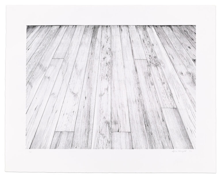
Image size: 12 x 23 1/2 inches (30.5 x 59.7 cm)
Paper size: 22 1/4 x 30 inches (56.5 x 76.2 cm)
Signed and dated lower right in graphite
(Inventory #28639)
Image size: 12 x 23 1/2 inches (30.5 x 59.7 cm)
Paper size: 22 1/4 x 30 inches (56.5 x 76.2 cm)
Signed and dated lower right in graphite
(Inventory #28639)
Image/paper size: 14 3/8 x 29 inches (36.5 x 73.7 cm)
Signed and dated lower right in graphite
(Inventory #28642)
Image/paper size: 14 3/8 x 29 inches (36.5 x 73.7 cm)
Signed and dated lower right in graphite
(Inventory #28642)
Image size: 16 x 18 inches (40.6 x 45.7 cm)
Paper size: 20 x 22 inches (50.8 x 55.9 cm)
Edition of 13
Signed and dated ‘Kiki Smith 2012’ lower right, numbered lower left in pencil
(Inventory #24627)
Image size: 16 x 18 inches (40.6 x 45.7 cm)
Paper size: 20 x 22 inches (50.8 x 55.9 cm)
Edition of 13
Signed and dated ‘Kiki Smith 2012’ lower right, numbered lower left in pencil
(Inventory #24627)
No results found.
10 Newbury Street, Boston, Massachusetts 02116
617-262-4490 | info@krakowwitkingallery.com
The gallery is free and open to the public Tuesday – Saturday, 10am – 5:30pm